Aura Migraine Tracker
Case Study
At Aura, we help users with chronic sinus and migraine issues track changes in air pressure. Providing advanced notice to users when pressure shifts might affect their symptoms can empower them to take preventative measures and live a more pain-free life. We also help users understand what baseline shift in pressure affects them, notifying them only when a projected pressure change occurs at that level.
The Problem:
According to the American Migraine Foundation, 40% of Americans suffer from pressure-based headaches. Currently, no applications alert users to upcoming weather patterns and individualize a user's experience. Aura aims to fill this gap by providing a personalized, informative experience for pressure-based migraine sufferers.
Our Team
My Role
Project Manager / Team Lead
User Researcher
Product Designer
User Interface Designer
Team Member One
User Researcher
Interaction Designer
Presentation Designer
Team Member Two
Information Architect
Brand Standards Developer
User Interface Designer
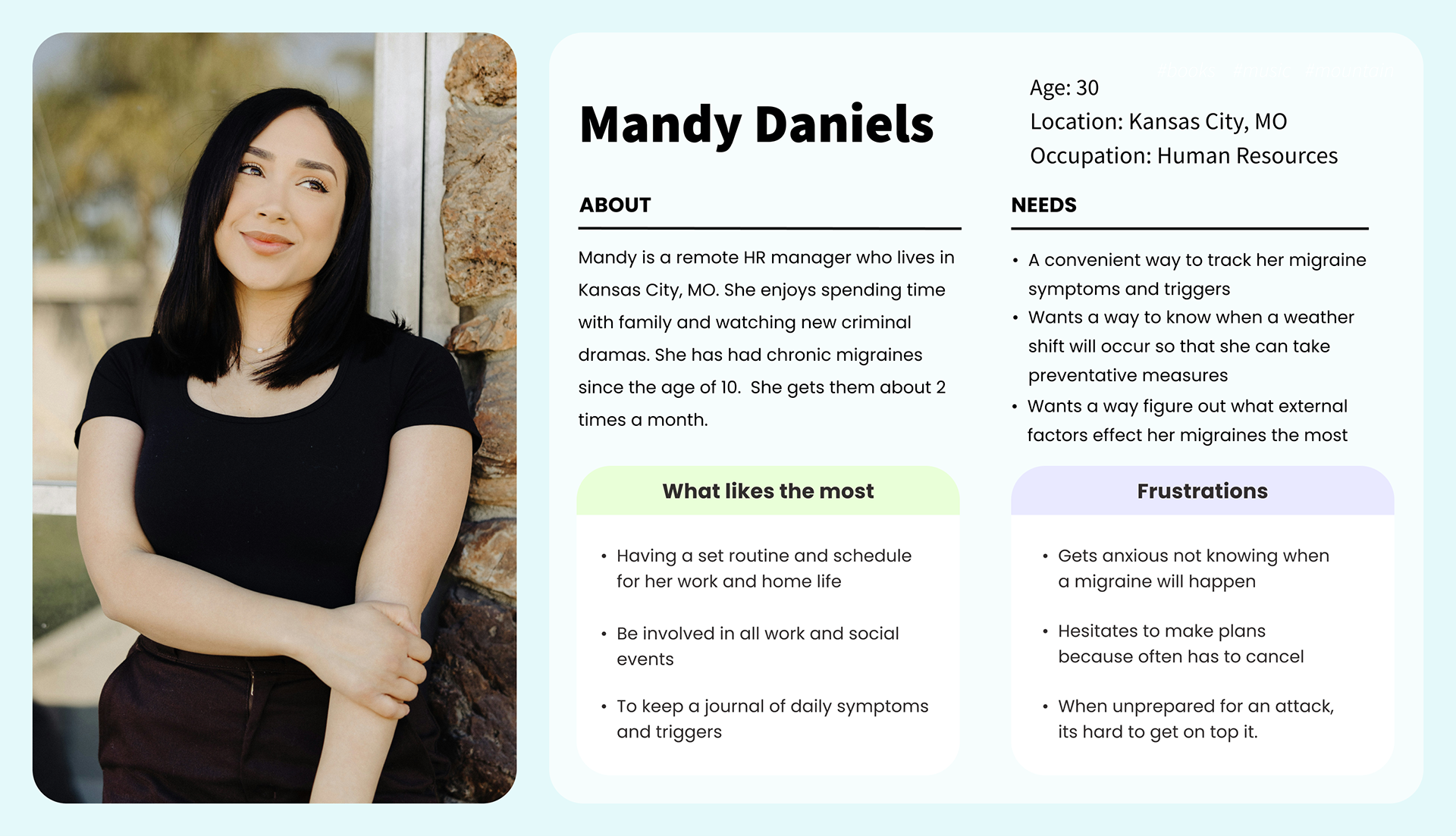
Mandy's Story
Mandy, like many people in the US, suffers from chronic migraines and has since she was a child. She has noticed that her migraines sometimes correlate with weather changes but is unsure what weather affects her the most. When she is unprepared for an attack, it is hard for her to get on top of managing her pain. Often, taking medication after she’s well into the migraine doesn’t help. So she can be suffering from a migraine for hours and sometimes days on end.
Our Research
Mandy is not alone, according to the American Migraine Foundation, 40% of Americans suffer from pressure-based headaches. We talked to a few potential users like Mandy to gain insight into their frustrations.
User Insights
Migraine sufferers whose symptoms are affected by the weather need ways to monitor large changes in humidity or temperature as well as pressure.
Users need uplifting messaging and positivity in their day because migraine sufferers often have nausea and other unpleasant symptoms. This has an impact on their mental health.
Some migraine sufferers are able to prevent the majority of their symptoms if they treat the headache in the early stages. These people, and others who don’t know how to prevent their migraines early, need a warning when they might have a flare-up so they can prepare.
Enter Aura
The Mission
We believe that by alerting people, like Mandy, who suffer from chronic sinus headaches or migraines to upcoming weather shifts that may trigger their symptoms we can empower them to take preventative measures and live a more pain-free life.
Features
After considering our competitors and the needs of our users, we came up with four critical features:
1. The app must track barometric pressure changes in real time so users can see changes as they happen.
2. Users must have the ability to log attacks, allowing the app to determine patterns in pressure that cause attacks.
3. Users need to have the ability to see previous pressure changes and retroactively add migraine data.
4. Users need to be notified of upcoming pressure shifts that may impact them so they can take preventative measures.
Architecture + Wireframing
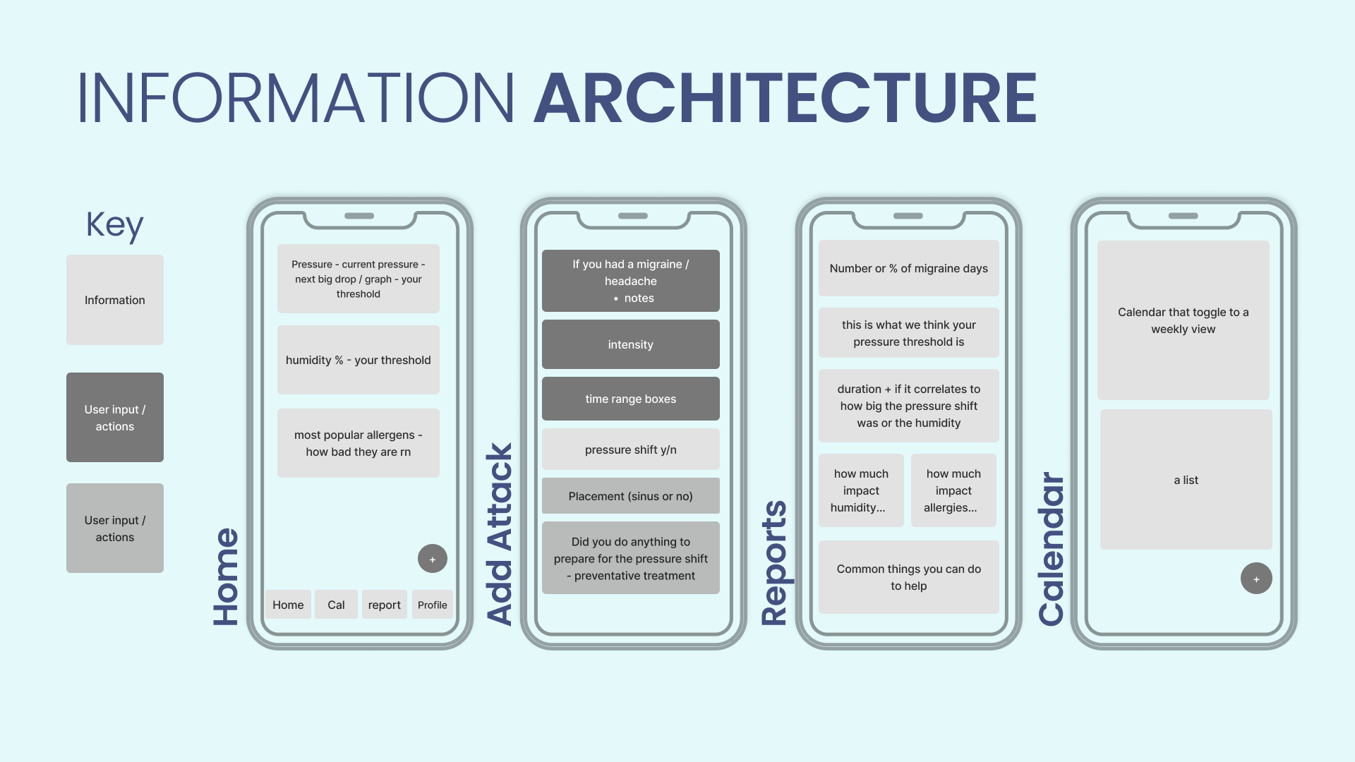
Information Architecture
First, we made a preliminary chart of the app layout, featuring four main screens and their content (right). Our priority was making Aura's key features easily accessible and understandable from minute one.
User Flows
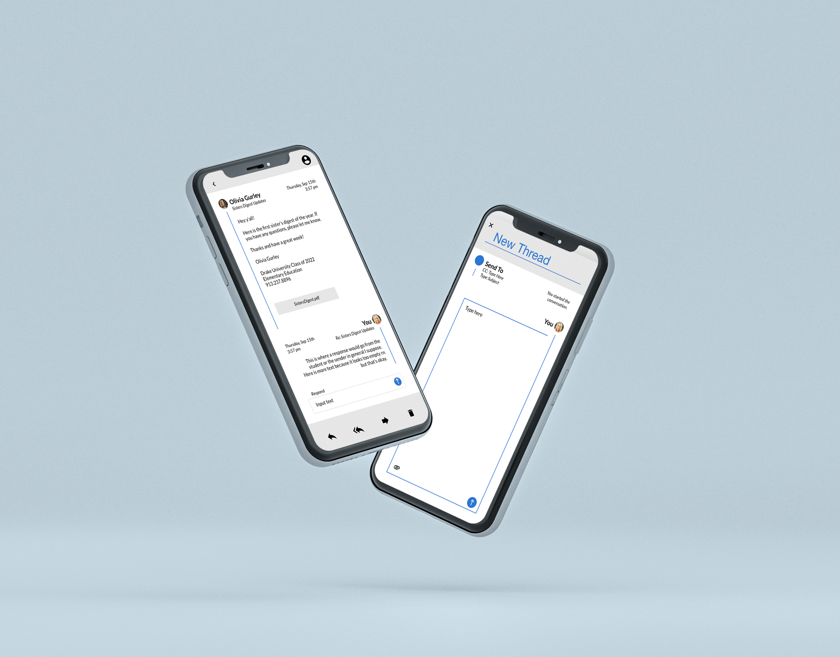
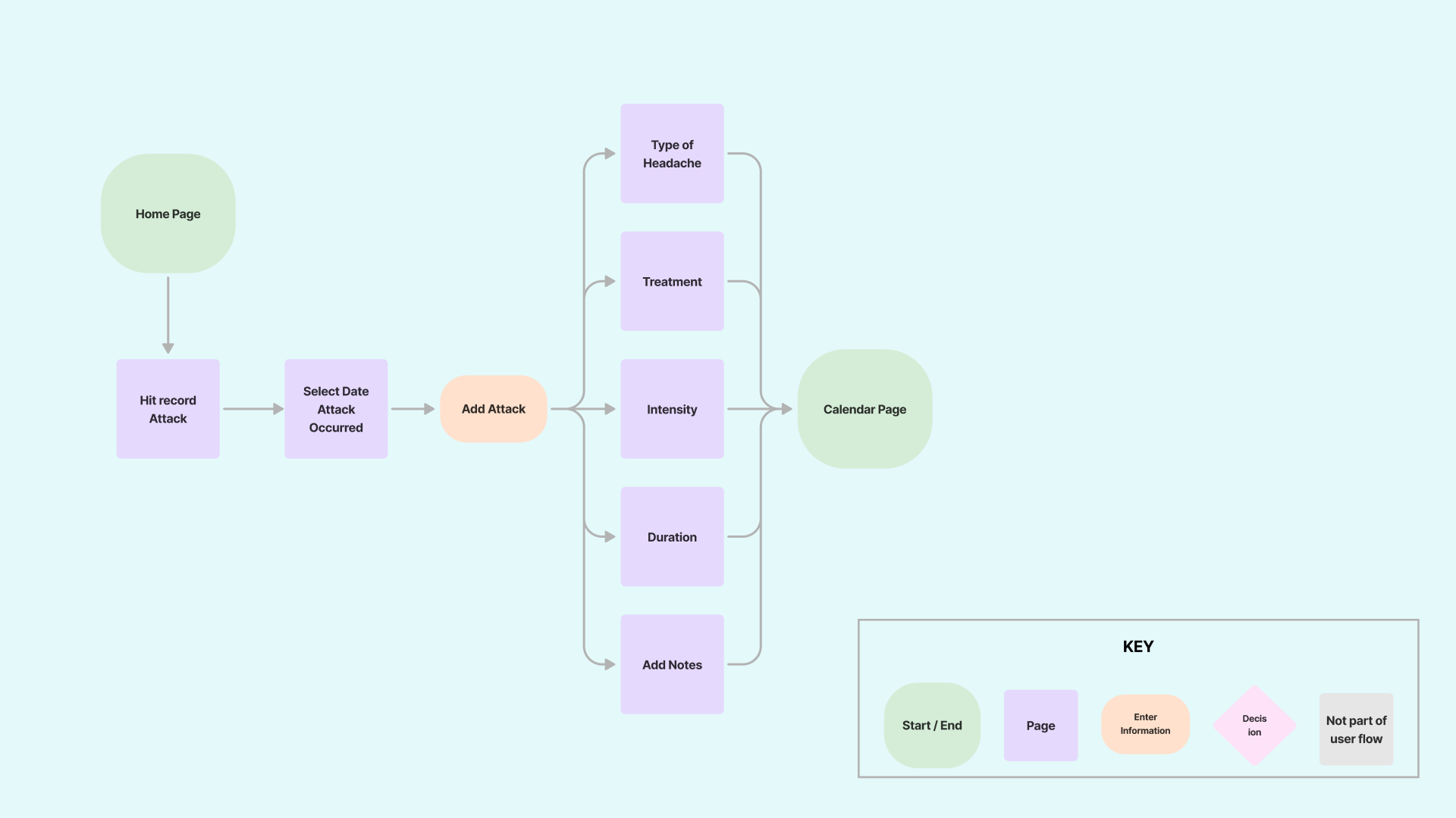
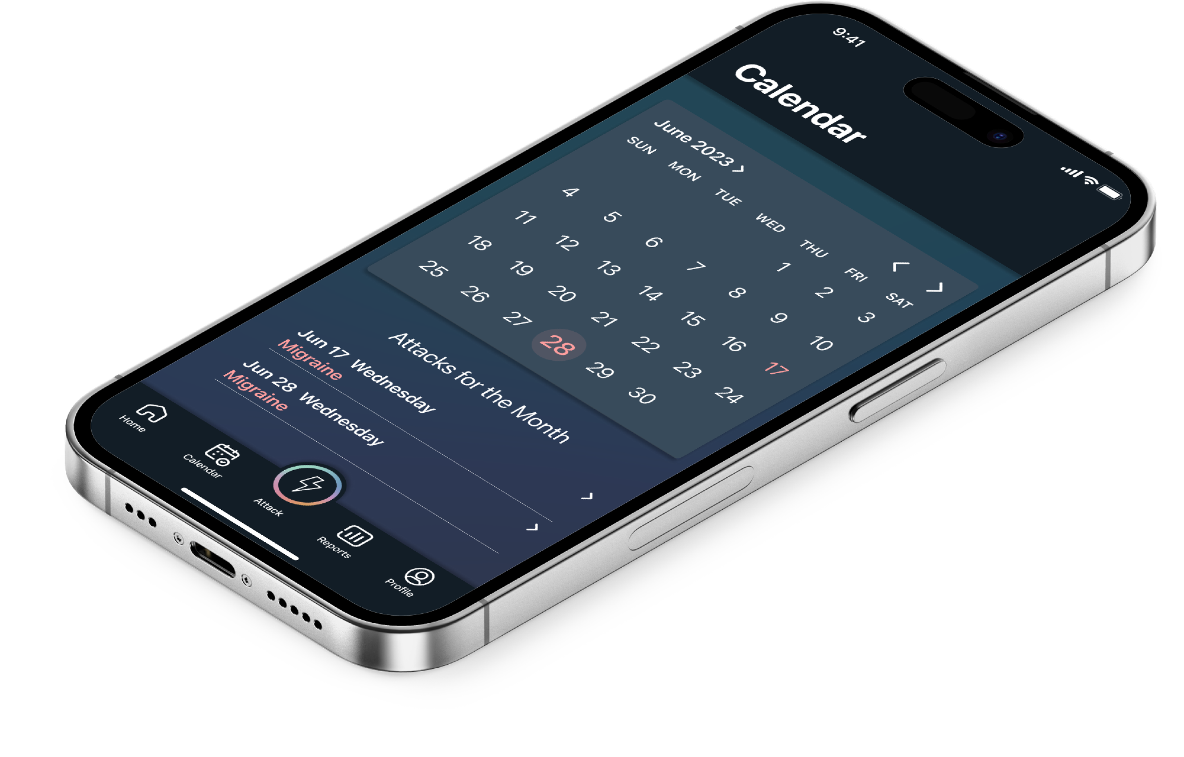
One of the most significant actions in the app is adding an attack. We knew the steps a user took to accomplish this would have to be simple and clear, as users might be experiencing a migraine as they log it.
The flow to the left shows the steps to record a migraine attack.
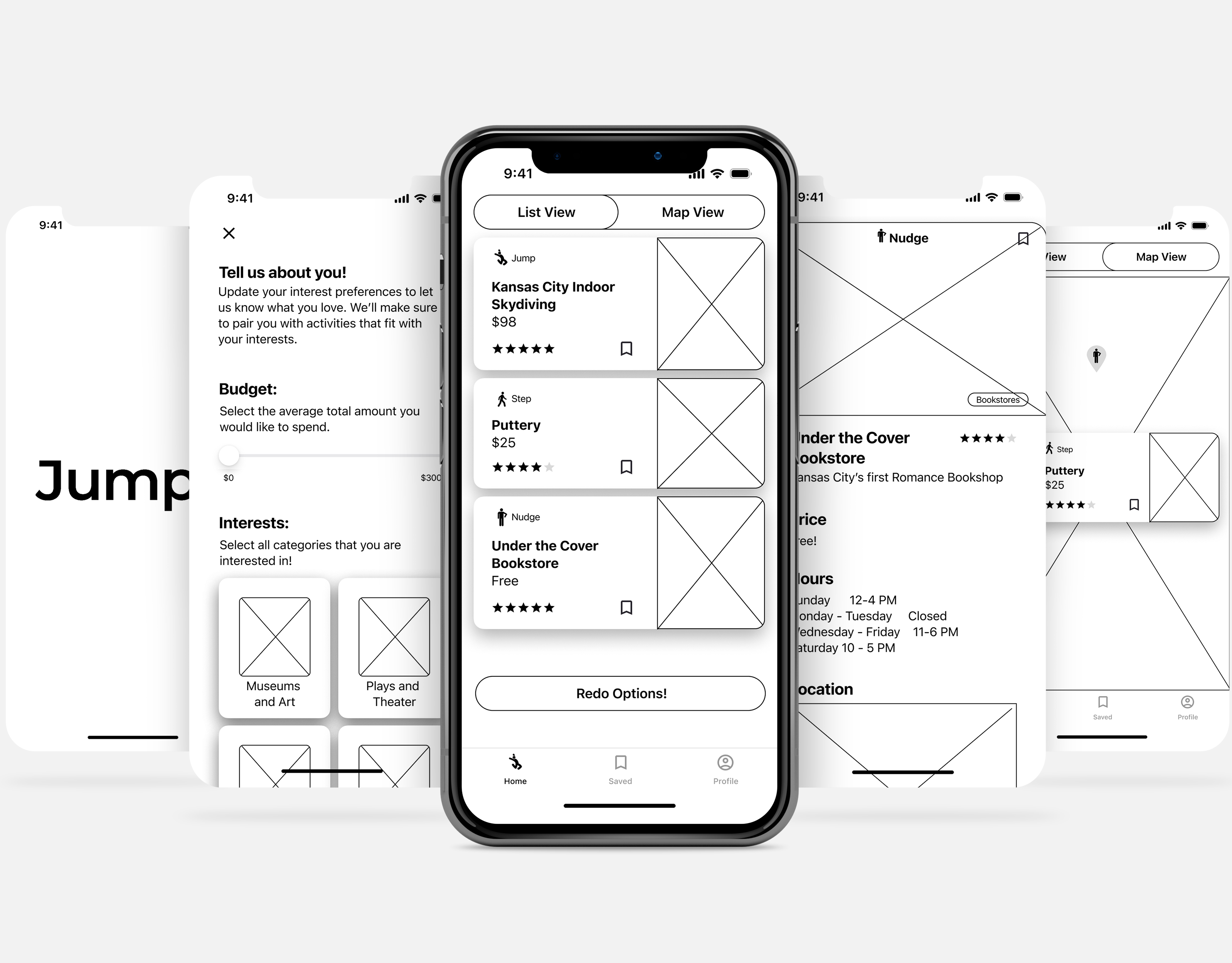
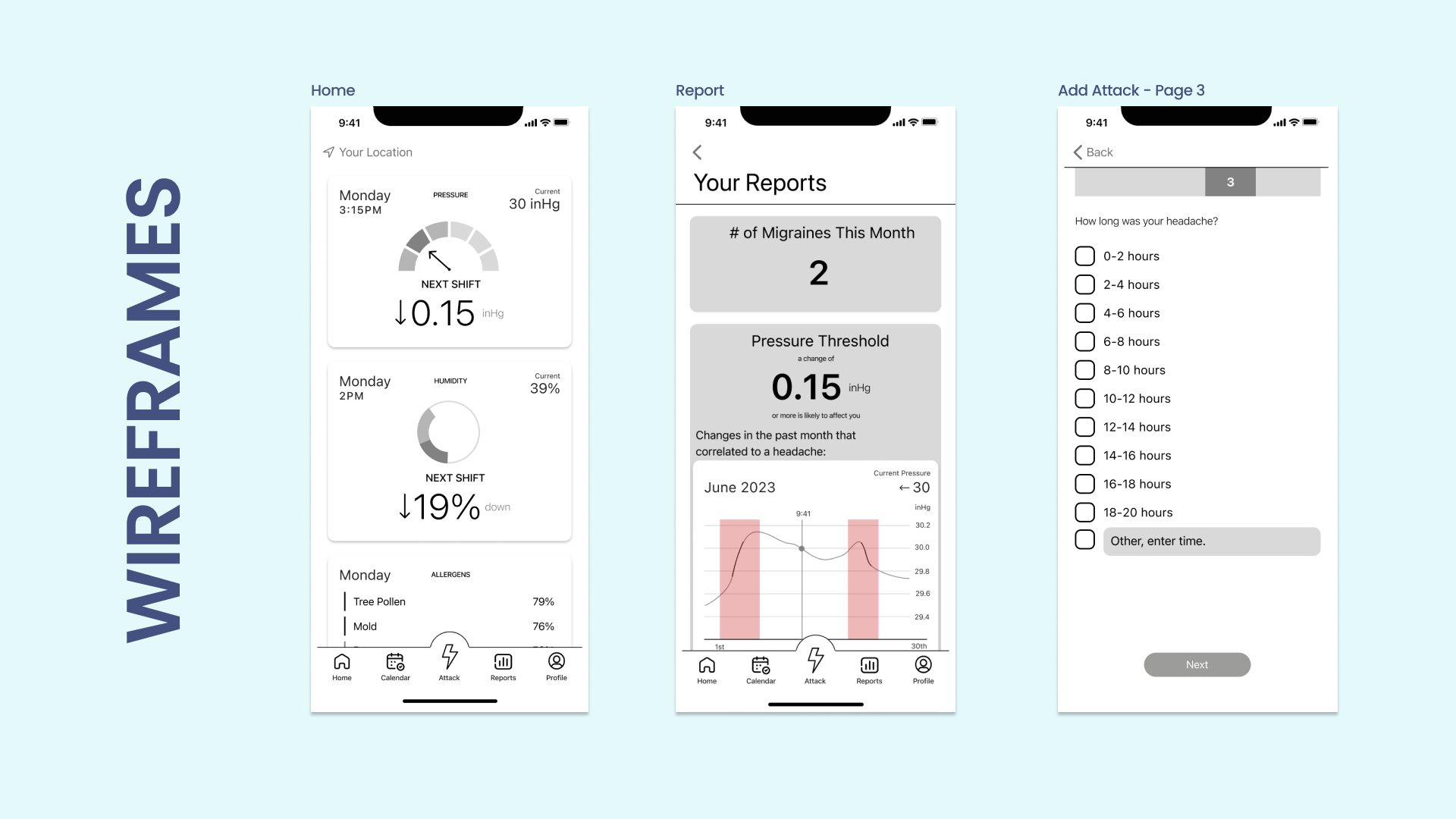
Wireframes
Three of the initial wireframe screens we created are shown below. The screens showcased all pertain to our critical features. However, our next tests showed that users found the data visuals in the first iteration confusing and unhelpful.
Usability Testing
In our first round of user testing, we found users could complete the majority of the tasks. However, users had difficulty comprehending the home and report screens. A few of the most prominent problems are listed below.
Problem One:
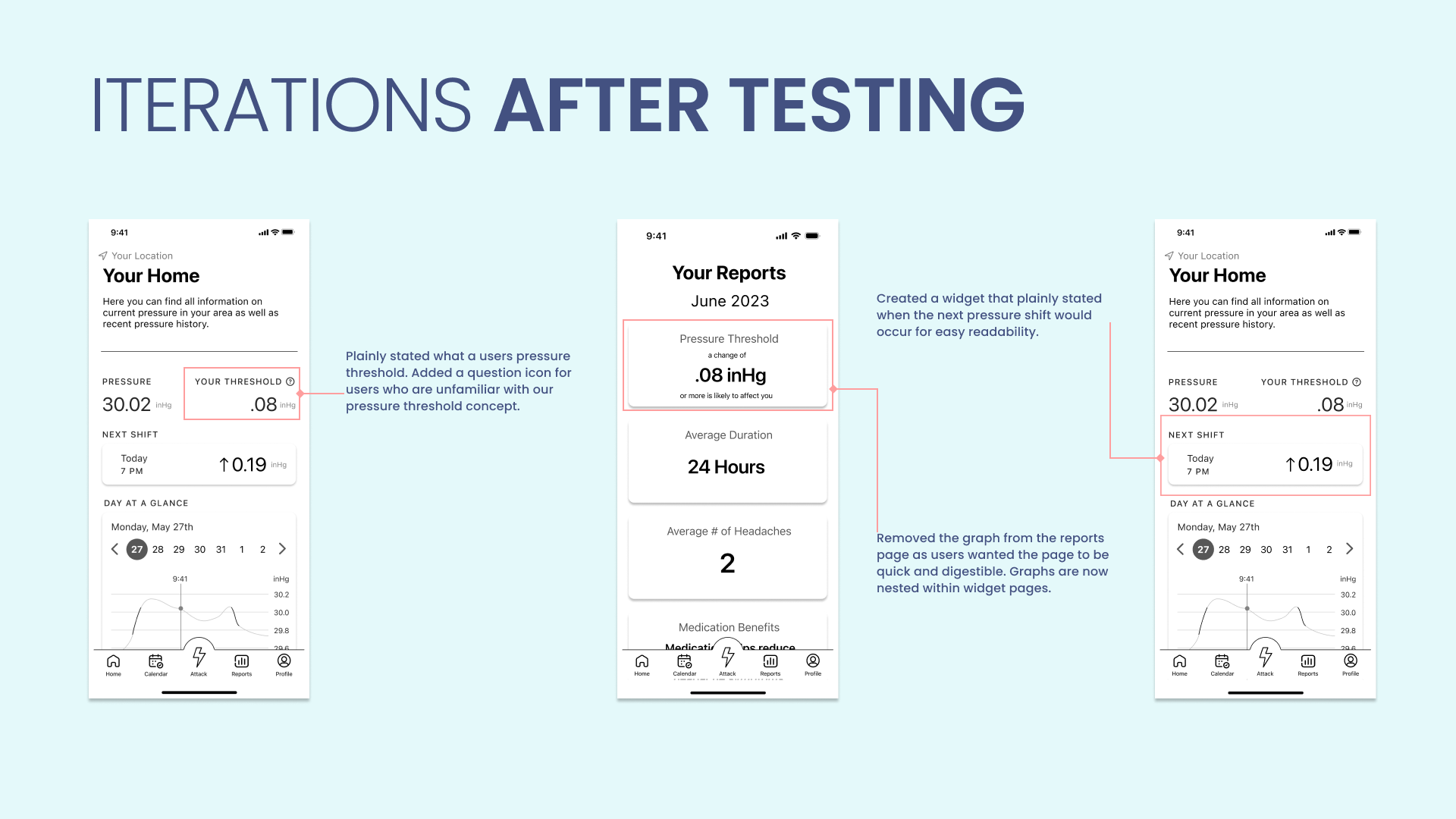
Only 50% of users could identify what pressure change had the potential to give them a headache. Since this feature was the basis of our app, we knew that we had to make some major changes to help users succeed.
Solution:
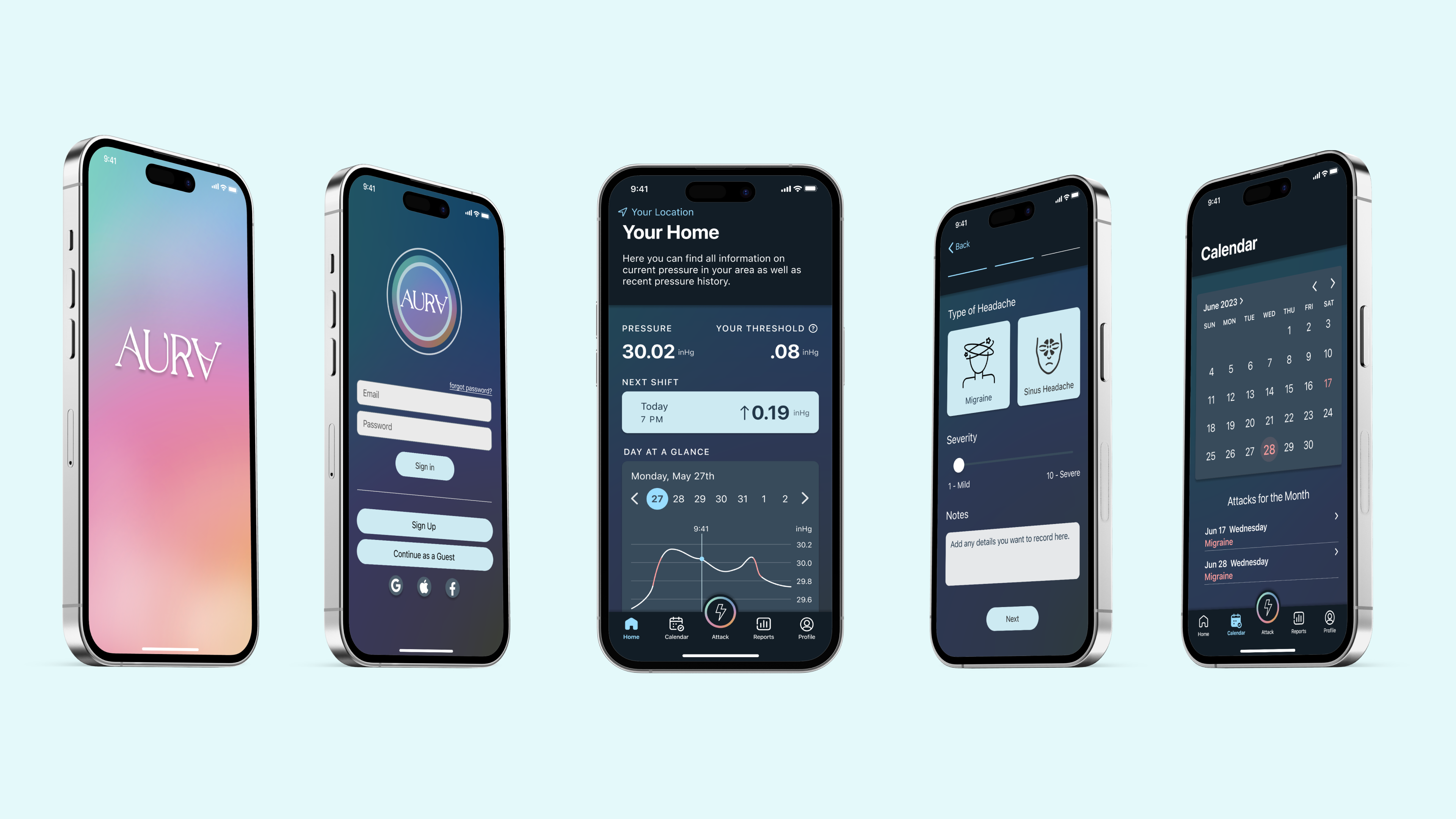
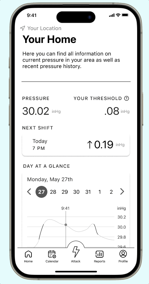
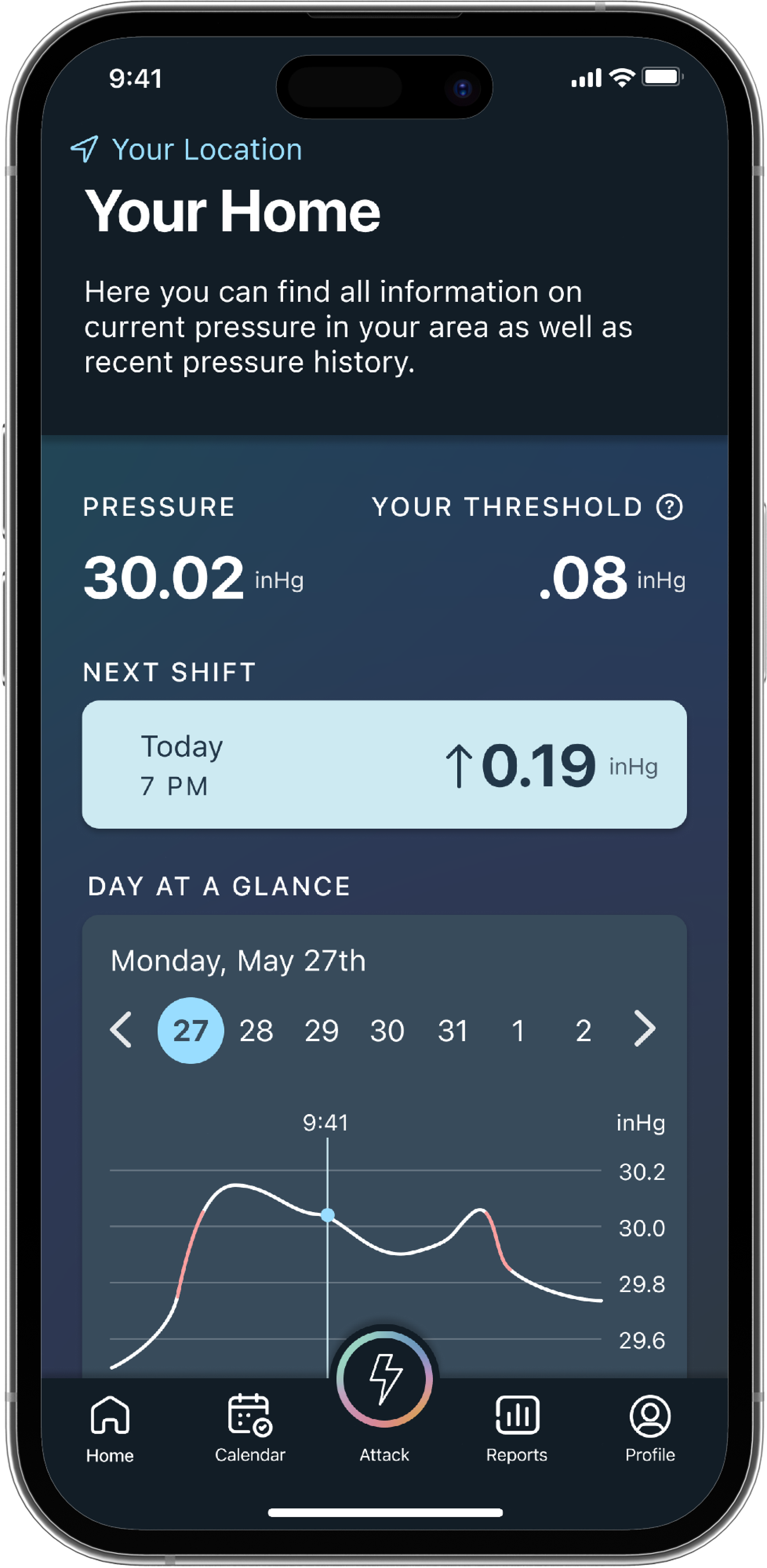
To help users, we created the Pressure Threshold - an individualized threshold showing the minimum change in barometric pressure that causes each user discomfort. We gave the feature a prominent place on the home screen and onboarding using standardized language. We also added a help icon to all screens, ensuring users would be able to find explanations.
Problem Two:
Users could not understand the abstract data visualization on the home page. They wanted more concrete numbers.
Solution:
We removed abstract data reports and added a daily graph so users can see pressure shifts. We also added a widget that only showed when the next pressure shift would occur to make this data visible and prominent.
These were by no means the only problems we found from our first round of user testing, the issues in our log totaled 19. However, the two problems above required major restructuring in our app, so we focused our design report on them. Below you can see the changes we made after testing.
A/B testing
Our A/B testing allowed us to see how users preferred to log a migraine from a previous pressure change. Test A took users straight into the add attack flow after they confirmed that a previous shift had caused an attack. Test B let users confirm the attack, then add the details at their leisure.
We found that the vast majority of users preferred the B flow. Even if they wanted to add the details right away, the additional step of confirming they would be doing this, saved from the confusion of moving directly into the attack flow.
Flow A
Flow B
35% Improvement
After we made our first round of changes to the prototype we saw that task completion went up 35%.
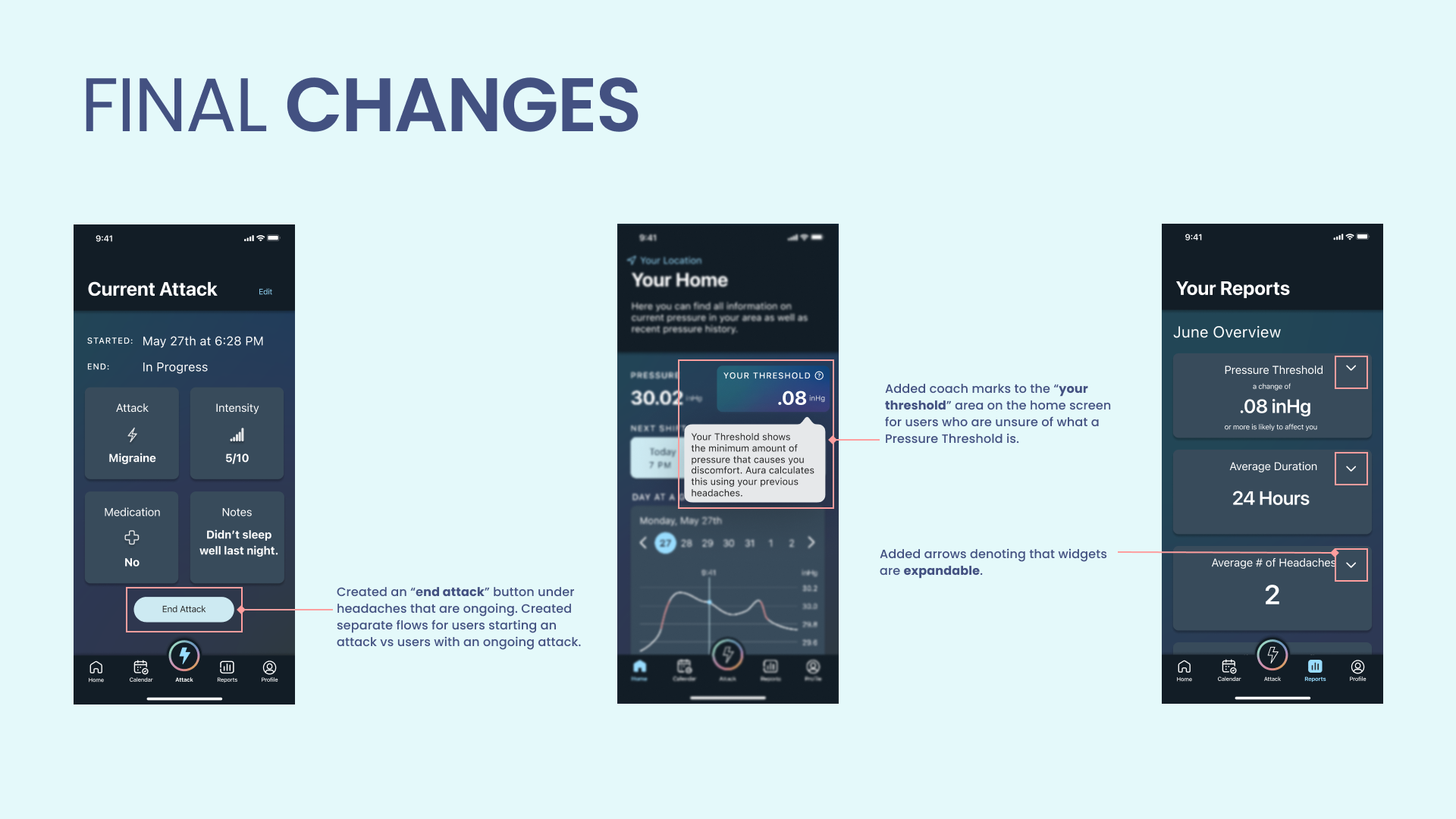
Almost every user was able to complete the tasks we gave them with no trouble. However, there were still some things we found we could improve, such as:
1. A way to end an ongoing attack.
2. There were some lingering problems with users understanding pressure thresholds.
3. There was no distinction between which widgets you could or could not click on the Reports page.
Solutions:
1. Add an end attack feature to ongoing migraines from the calendar and attack pages.
2. Add additional coaching during onboarding and on the home screen to explain Pressure Threshold.
3. Add affordances to the widgets that expand on the reports page.
We began to make these changes while also implementing our style guide - creating our high-fidelity prototype.
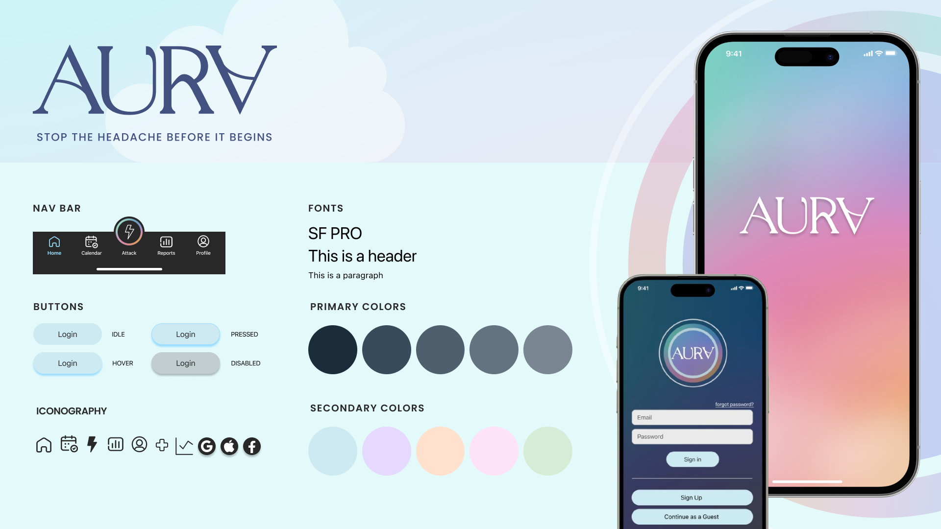
Style Guide
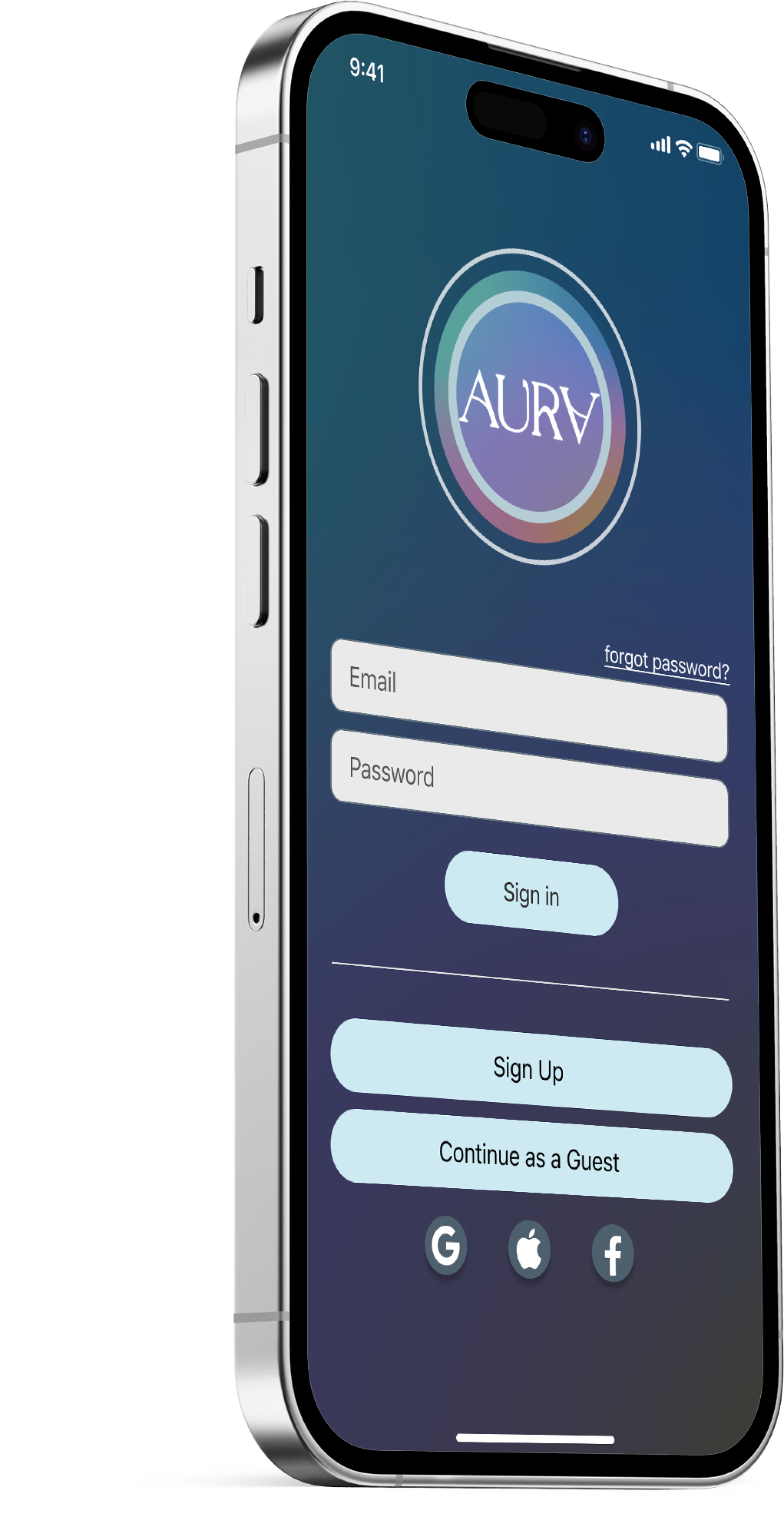
We wanted users to feel uplifted and empowered by our app, both in our wording, their interactions with the app, and our chosen style. We landed on a soft, pastel color pallet to convey a sense of peace and an airy, almost sunset-like look.
Many of the users we interviewed told us that they experience light sensitivity while having an attack, so we chose to keep the app set in dark mode, making it easier to use while having a migraine.
High Fidelity
Final Prototype
Next Steps
Looking forward, we can see opportunities to improve Aura, providing even more features for users. Adding humidity and allergen metrics to the app could benefit users, as research shows these can cause headaches. We also want to bring more joy to users by adding uplifting messaging when they first open the app for the day or celebration messages for extended periods when they are headache-free.
Cross-platform options such as smartwatch apps would give users even more ways to stay informed and a larger likelihood of seeing app alerts and preventing migraines before they start.
If you would like to view the entire case study, click here.