Honest Eats
Case Study
Our team knows that shopping can be difficult. We strive to help improve the grocery shopping experience for users. We can up with an app that helps users find the best foods for their family by providing high-quality allergy-friendly options that fit their budget. We further improve the shopping experience by providing location features to help users navigate the store.
The Problem
American shoppers often have a hard time selecting foods that provide nutritional value and fit their diet. Honest Eats targets these problems, giving users both nutritional ratings and alternative recommendations that fit their diet.
Our Team
My Role
User Researcher
User Story Creation
User Interface Designer
User Story Creation
User Interface Designer
Team Member One
Information Architect
UI Designer
UI Designer
Team Member Two
UI designer
User Researcher
User Researcher
Research
38 Surveyed / 6 Users Interviewed
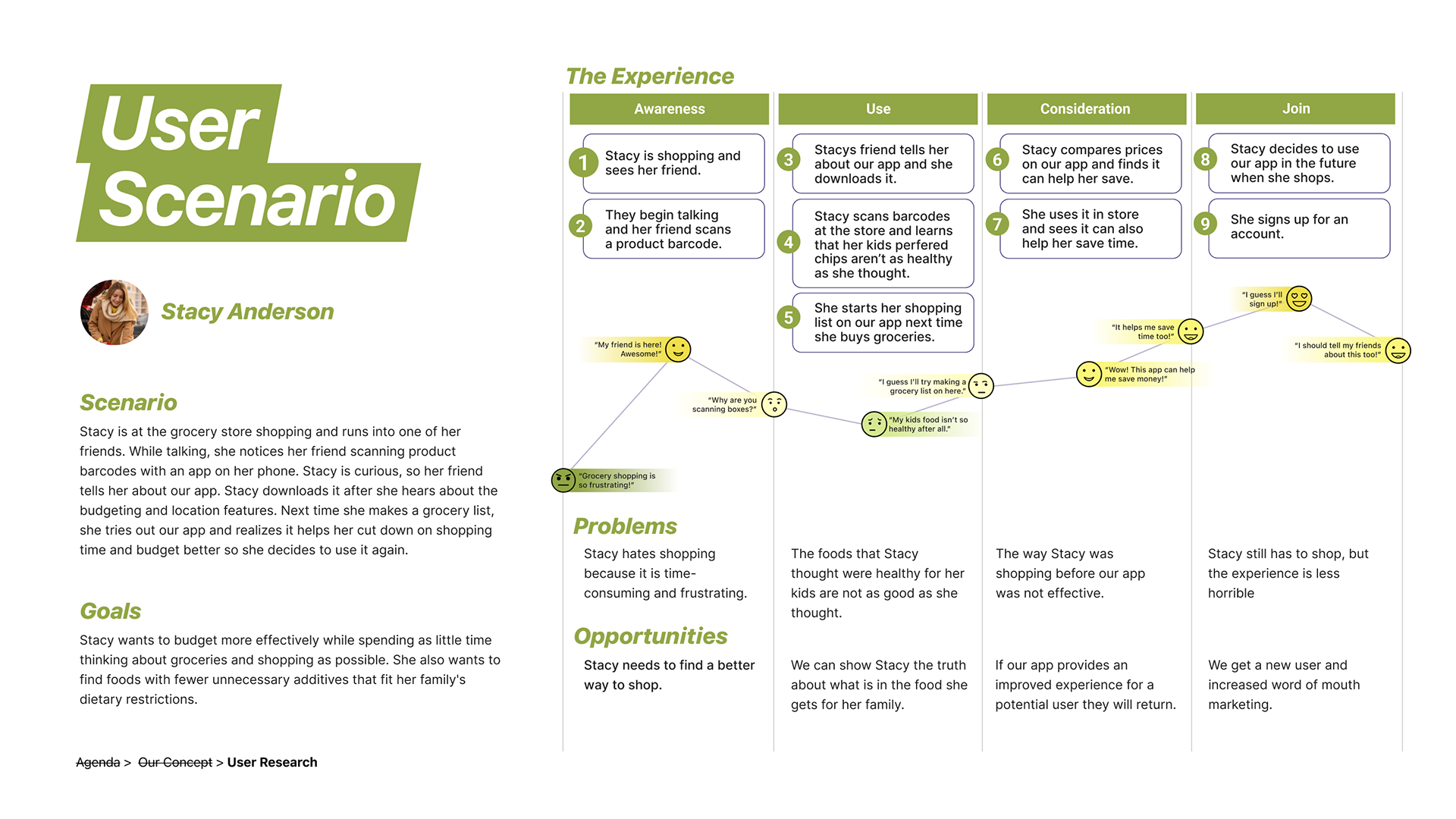
From these 6 interviews, we found the five most common pain points for our user base, females who are the primary household shoppers for 3 or more family members. We then used these pain points to create both a user story and a user journey map to help communicate to needs and frustrations of our users.
User Pain Points
Food Preferences / Product quality and dietary restrictions determined most buying decisions for our users.
Food Transparency / Most users wish companies would be more conscientious about what they put in foods. They often check labels.
Budgeting / Constant price inflation frustrates primary household shoppers. They often purchase cheaper options.
Hates Shopping / Most primary shoppers dread the experience, finding it an exhausting necessity.
Driving Factor / Children are often the driving factor that make shoppers more conscious of what they are purchasing.
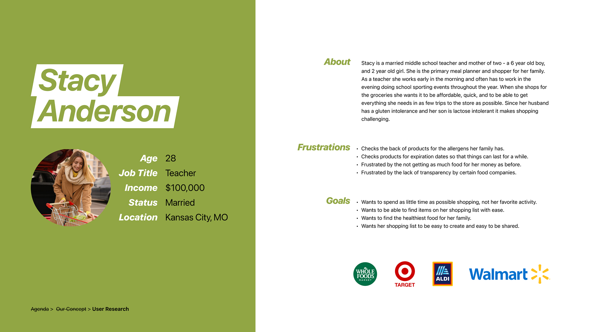
Persona
User Journey
DEFINITION
Based on our research, we determined the features that would provide the benefits to our target user base. We sorted these into four categories: Must, Could, Should, Won’t.
Must
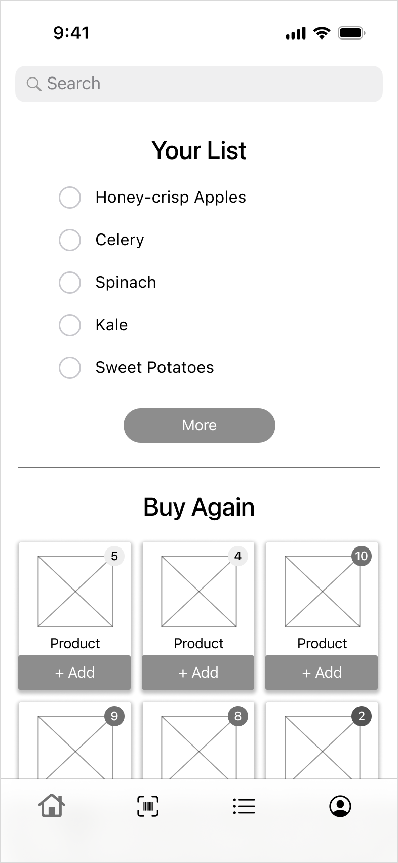
Barcode scanner
Product ratings
Product locations in store
Dietary restrictions
Could
Price comparisons
Real-time prices
User Flows + Paper Prototype
We created user flows to show how our primary user base would move through the app. Then we broke up the screens we wanted to create, and each sketched our preliminary ideas for an interface. Below are some of my sketches from our first round of designs.
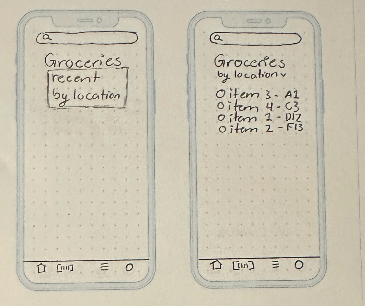
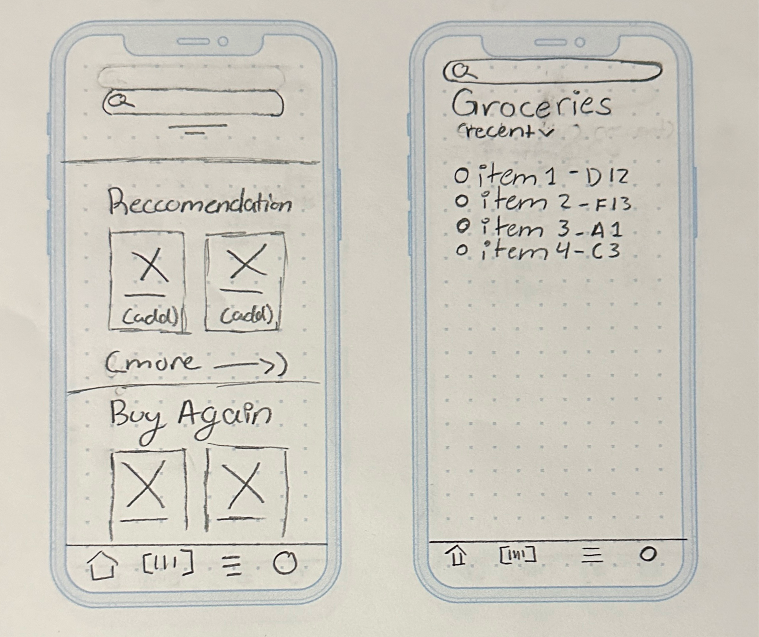
Ideation
Wireframes
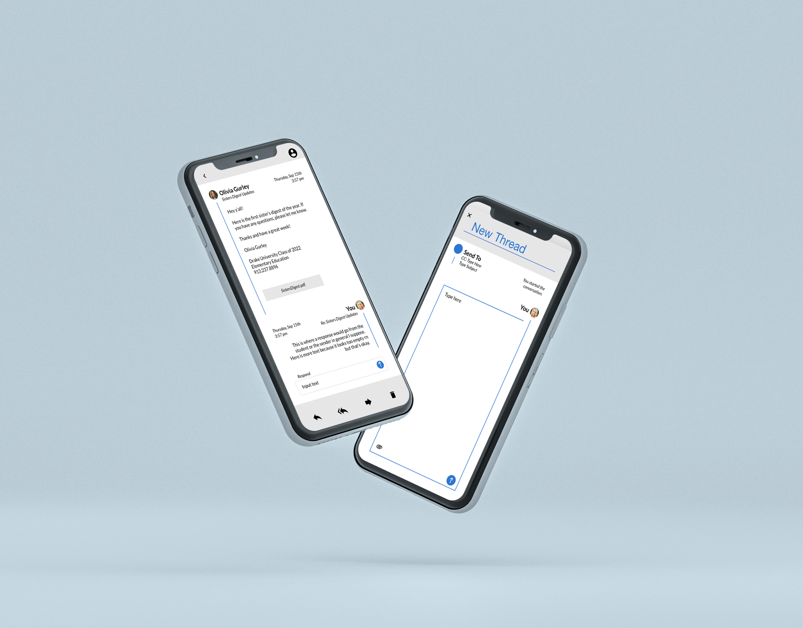
We took these designs and created a preliminary wireframe that we could user-test.
Guerrilla User Testing
7 Users Tested / 4 Tasks Tested / 1 Test Failed
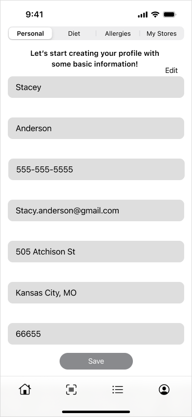
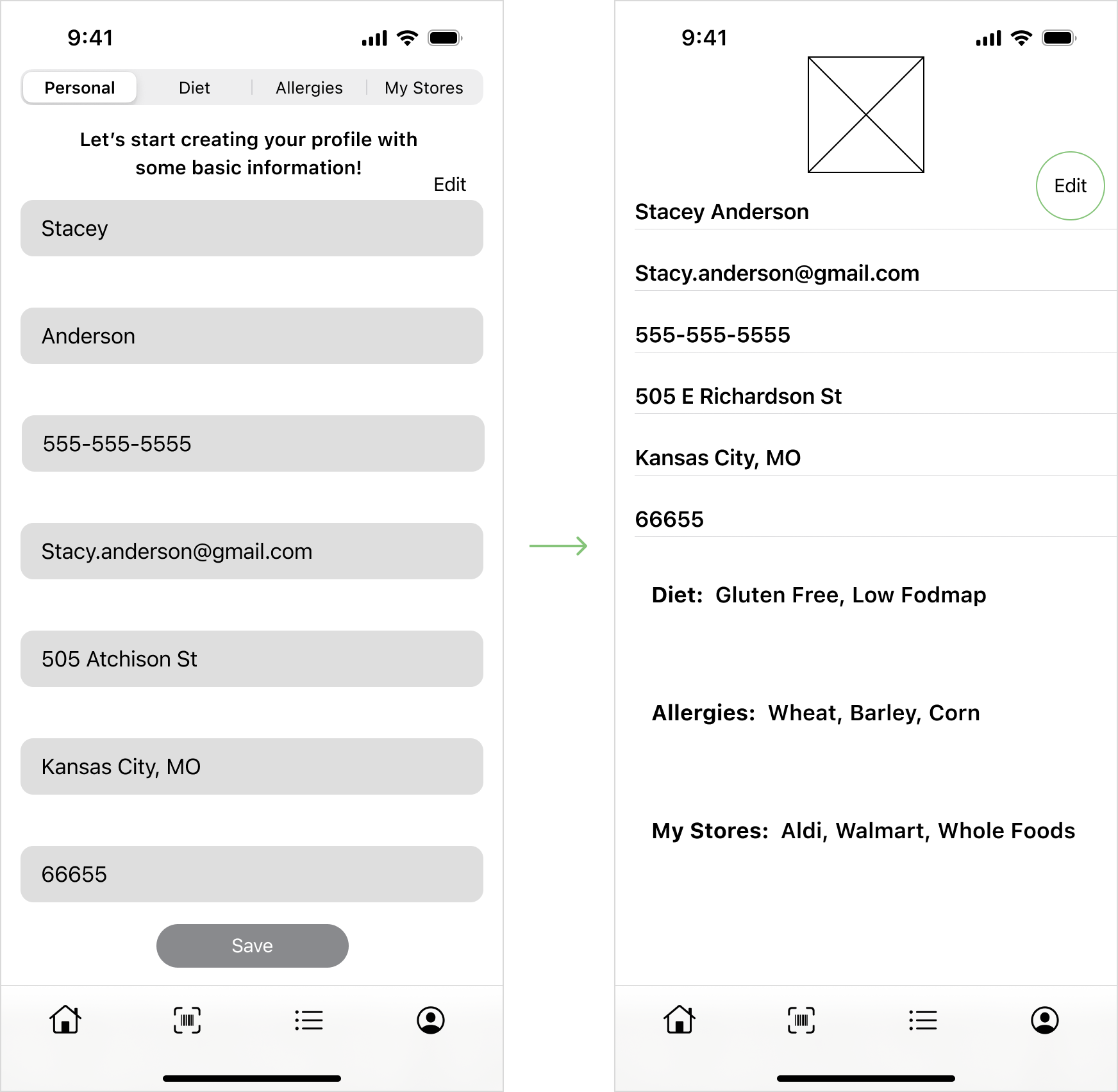
After testing the prototype with users, we found that two of our tasks were failed. We found that most of our users were able to complete each task except Task 4 / Editing a Profile.
Success Rate / 57.14%
Failed or Incomplete / 5/7 Users
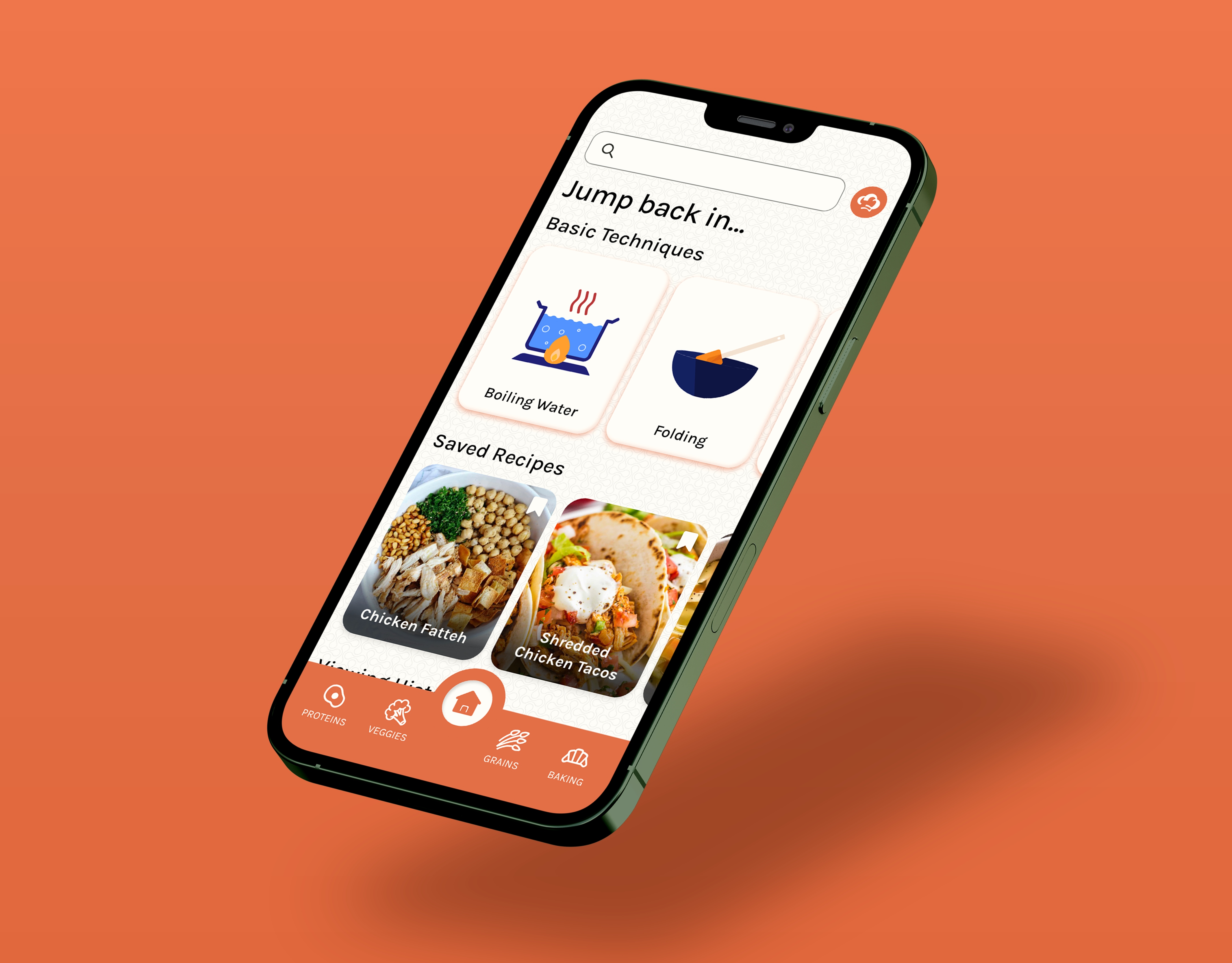
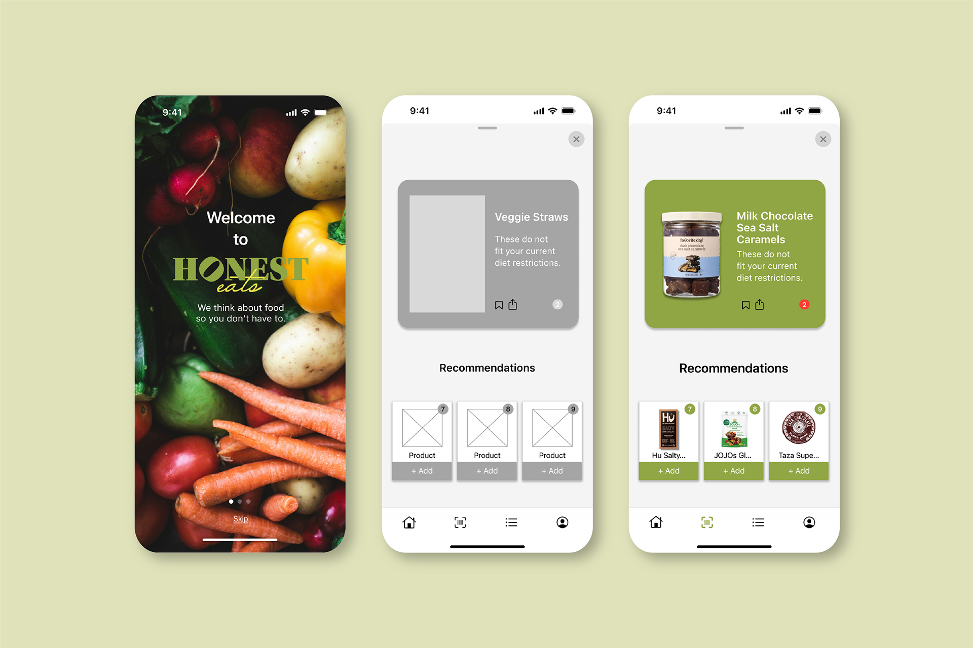
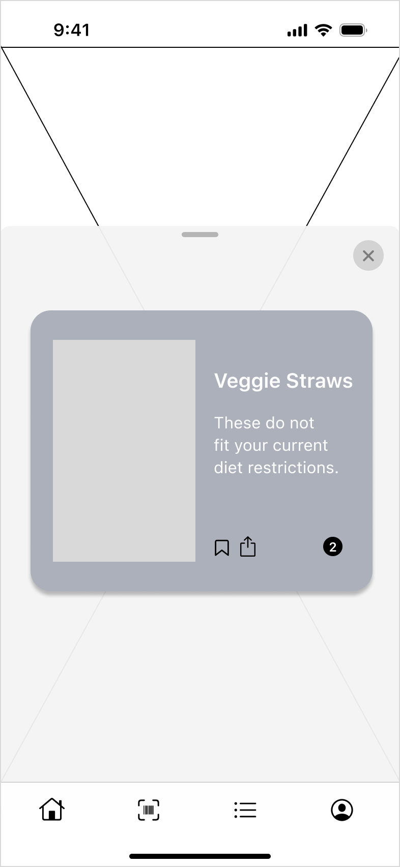
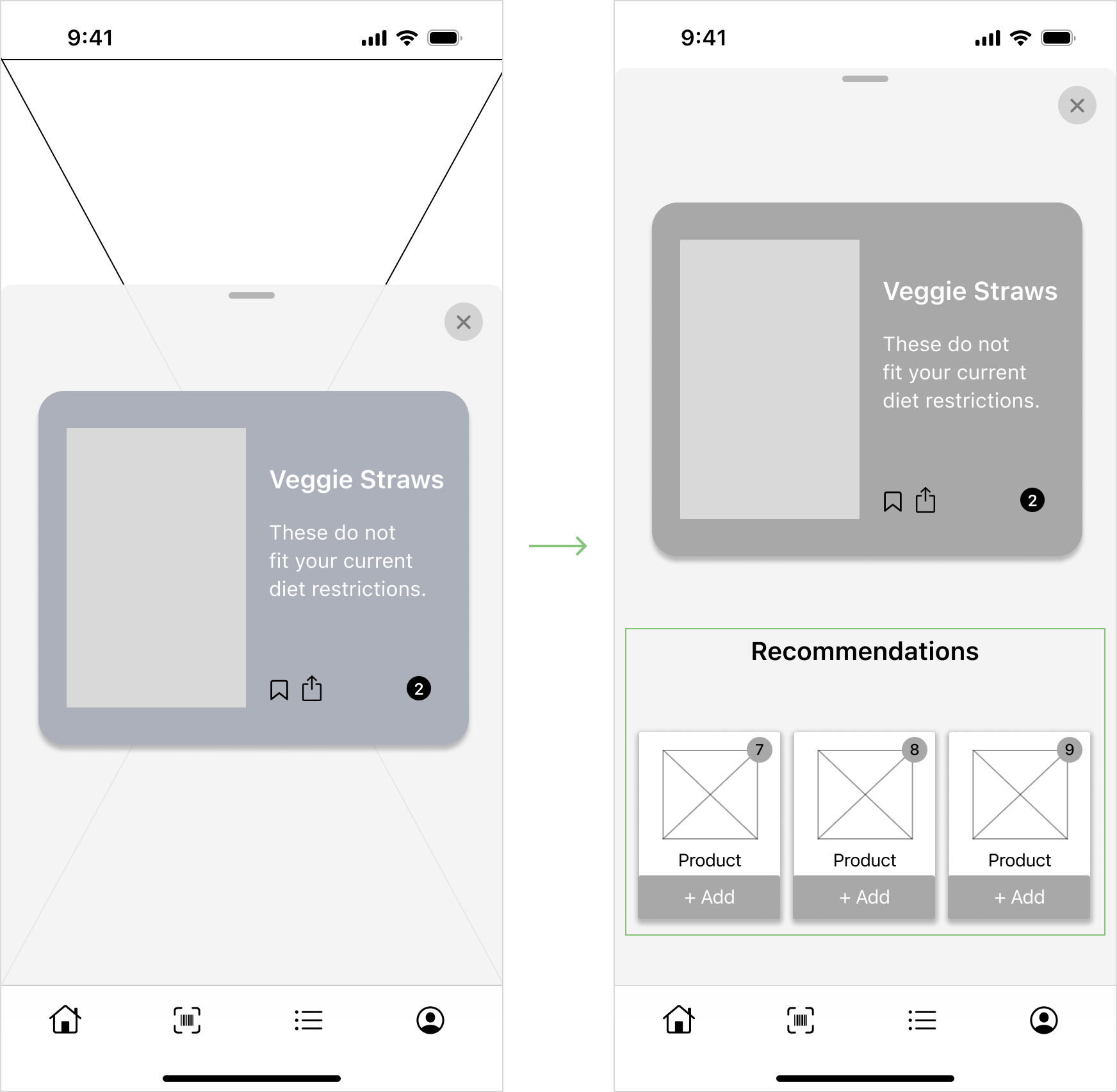
We also found that while users liked getting information about a single product from the scan page, their primary goal was to find healthier alternatives. To help users achieve this, we added cards underneath the product information that provided alternatives that better fit a user's diet and health requirements.
Final
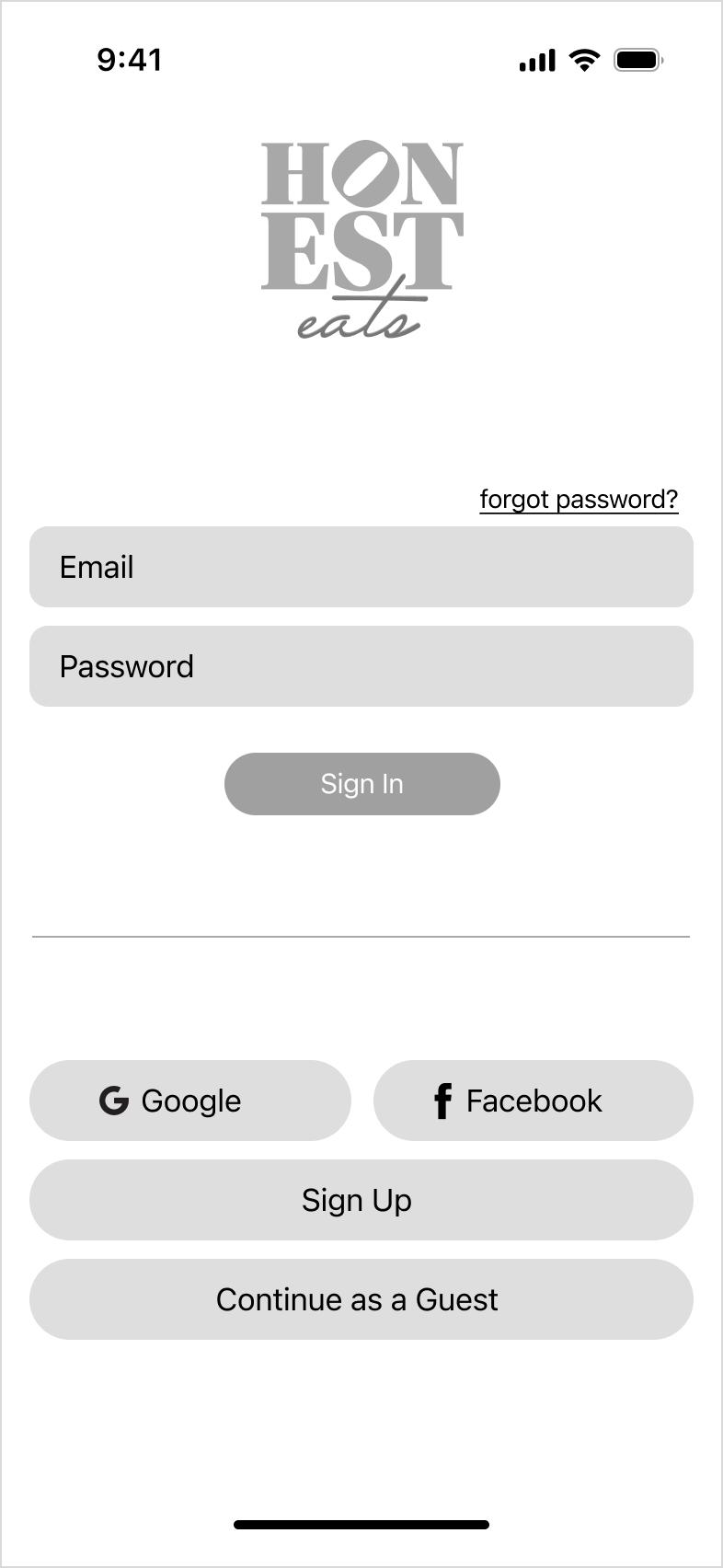
Hi-Fi Prototype
After making these changes, we moved to the creation of a high-fidelity prototype. You can pursue this below. I designed the wireframes and high-fidelity pages for coaching, login, and home.